In this section, we are going to explore each variable separately. We are going to summarize the data for each feature and analyze the pattern present in it.
Univariate analysis is an analysis using individual features. We will also perform a bivariate analysis later in this section.
Univariate analysis
Now, let us do a univariate analysis for the age, education, work class, hours per week, and occupation features.
First, let’s get the counts of unique values for each column using the following code snippet:
df.nunique()
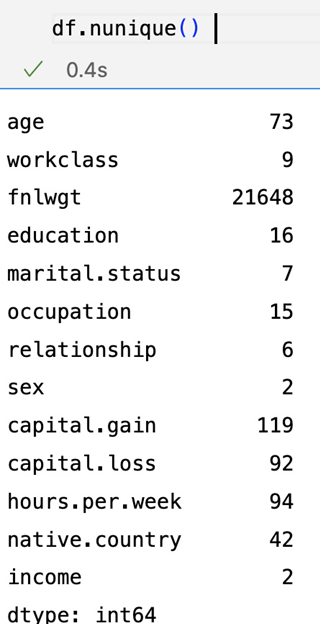
Figure 1.14 – Unique values for each column
As shown in the results, there are 73 unique values for age, 9 unique values for workclass, 16 unique values for education, 15 unique values for occupation, and so on.
Now, let us see the unique values count for age in the DataFrame:
df[“age”].value_counts()
The result is as follows:
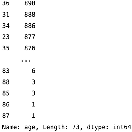
Figure 1.15 – Value counts for age
We can see in the results that there are 898 observations (rows) with the age of 36. Similarly, there are 6 observations with the age of 83.
Histogram of age
Histograms are used to visualize the distribution of continuous data. Continuous data is data that can take on any value within a range (e.g., age, height, weight, temperature, etc.).
Let us plot a histogram using Seaborn to see the distribution of age in the dataset:
#univariate analysis
sns.histplot(data=df[‘age’],kde=True)
We get the following results:
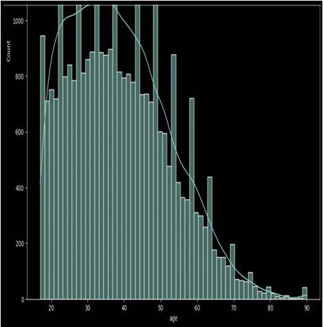
Figure 1.16 – The histogram of age
As we can see in the age histogram, there are many people in the age range of 23 to 45 in the given observations in the dataset.
Bar plot of education
Now, let us check the distribution of education in the given dataset:
df[‘education’].value_counts()
Let us plot the bar chart for education.
colors = [“white”,”red”, “green”, “blue”, “orange”, “yellow”, “purple”]
df.education.value_counts().plot.bar(color=colors,legend=True)
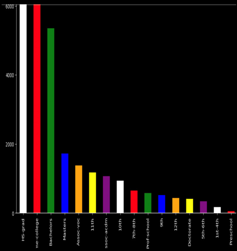
Figure 1.17 – The bar chart of education
As we see, the HS.grad count is higher than that for the Bachelors degree holders. Similarly, the Masters degree holders count is lower than the Bachelors degree holders count.
Bar chart of workclass
Now, let’s see the distribution of workclass in the dataset:
df[‘workclass’].value_counts()
Let’s plot the bar chart to visualize the distribution of different values of workclass:
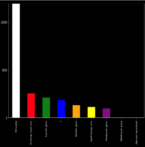
Figure 1.18 – Bar chart of workclass
As shown in the workclass bar chart, there are more private employees than other kinds.

No Responses